PeaceTXT: Using the design process to decrease violence

photo credit: Mr.Montrose

Our tour guide points to a nightclub with a brown awning and the windows sealed up with cinderblocks.

He points as we roll by in the minivan. "That's where a lot of things start that end up with someone getting shot." 

After scanning the intersection, he slowly turns right. "The nightclub and the high school, stuff starts in those two places and ends up getting finished in the street."

Our guide is a "violence interrupter" for Cease Fire. 

Read More

WARNING: Designers Tend to Fall Prey to Ideas!

"Designer vs. Dinosaur" by Lillian (6) and Peter (40)

Robert "Fabi G" Fabricant is inspiring jealousy (in me) by being in East Africa, blogging, and hobnobbing with the globally challenged superheroes and villains at the World Economic Forum.

His observations in his Fast Company post examine the long shadow cast by the rise of Design Thinking.

Specifically, Fabricant calls out the dirty little secret that designers--while clever, innovative and unafraid of funky footwear--don't actually know how to get stuff done within complex systems.

Read More

Personal Design Kaizen: 15 Tips for your continuous improvement

from Presentation Zen:

Kaizen.slide

Kaizen (改善) means "improvement" — "kai" (改) means change/make better, and "zen" (善) means good — but as the term is used as a business process it more closely resembles in English “continuous improvement.”

Kaizen is one of the keys to the steady improvement and innovation found at successful companies in Japan such as Toyota. Says Matthew May, in his book The Elegant Solution: Toyota’s Formula for Mastering Innovation, “Kaizen is one of those magical concepts that is at once a philosophy, a principle, a practice, and a tool.”

Though Kaizen is a tool used by corporations to achieve greater innovation, productivity, and general excellence, it’s also an approach, an approach that we can learn from and apply to our own lives as we strive for continuous improvement on a more personal level. We can call this “Personal Kaizen.” Others have applied the personal kaizen approach to personal efficiency or GTD. You too can take the spirit of kaizen and apply it to your own unique personal kaizen approach to improve — step-by-step, little-by-little — your design mindfulness, knowledge, and skill. READ MORE >>

Hybrid Thinking at P&G: Design meets Strategy


Procter and Gamble

When A.G. Lafley was named CEO of Procter & Gamble during the summer of 2000, her job was remarkably ambitious: Make innovation happen at P&G.

To remain the world's preeminent maker of useful stuff for the house, P&G needed to make a lot of changes very quickly and appointed Claudia Kotchka as the company's first-ever VP for design strategy and innovation in 2002.

Her job was remarkably ambitious: Make innovation happen at P&G!

And she did through up-endeding the status quo in P&G's product development process. She made several bold moves that any company may want to consider.

Read More

The Product Failure Bin

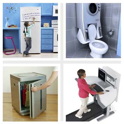
ABOVE: "Wacky Hybrid Appliances" from This Old House On-Line

My family used to have a gag gift that would show up every Christmas in someone's gift pile. The "Boob Bath Mat" never failed to shock and awe.

Each year, it seemed as if the victim never saw it coming.

Lots of time and energy goes into products that never see the light of a showroom floor. So, how did this monstrous mash-up product ever make it to the marketplace?

Someone--a team of someones, in fact--had to propose the idea, design it, send the specs to a factory in China, produce a catalog layout, write sales copy, coordinate the shipping, etc.

Since innovation is being touted as our only way out of the eco-financial desert of Western Civ, we had better get smart about finding, designing and deploying good ideas.

Read More

Colorbrewer 2.0

© Cynthia Brewer, Mark Harrower and The Pennsylvania State University. www.axismaps.com

When building maps and information graphics, choosing the right colors to help designate variables--whether population, temperature, or campaign dollars--is a time-consuming challenge.

How does one choose colors that are effective in communicating data, that can be read by the colorblind, that can be considered print fiendly and/or "photocopy-able" ? 

The folks at Penn State have built Colorbrewer 2.0, an effective tool to swiftly aid in the process.

Once a palette is chosen, this free on-line tool allows for easy export to ArcGIS (a mapping app), Excel, or any Adobe product. You can also simply copy and paste the RGB, CMYK or HEX values.

Wordle Goes Mainstream

A century of most popular baby names - top 50 by decade

Yesterday's post commented on Fast Company's recognition of the importance of visualization skills. In their commentary, FC posted screenshots and video of word-images created with Wordle.

These Rorchschach-like wordmaps are fun, easy and effective to create with this (free) java-based web service. Many websites (including ours) now use the resulting images as navigation, sitemaps or splash screens. The Wordles give the viewer an instant impression of themes and importance ideas through font size and color.

I was blown away to see a Wordle used on the front page of USA Today as a feature article--not on the tool or on data visualization, but used as a graphic to illustrate the shifting trend in baby names!

Fast Company: Is Information Visualization the Next Frontier for Design?

The Tokyo firm Information Architects created this Web Trend Map which presents the most popular Internet sites in the intelligible graphic language of a subway system.

It is great to see that Fast Company is catching the visualization religion.

This post mentions the Obama speech Wordles, Tufte's screed against PowerPoint, and blogs that cover visual complexity (including the blog, Visual Complexity

Visualization may play a big role in wising up consumers. In the future, we're told, sensors will pick up tiny bits of info on every aspect of our lives and they will be played back to us as graphics. The smart grid, for example, will read the energy use in your home and send back understandable displays suggesting how you might save money by, say, waiting an hour to turn on your air conditioner or reducing your thermostat by two degrees. It will be up to architects to imbed this feature in the home in a way that allows us to interact more efficiently with our surroundings.

It's good to know, however, that Alphachimp Studio is on the frontier of design

Check out more Obama visualizations not mentioned by Fast Company (bastages) at The Center for Graphic Facilitation:

Searching for Value in Ludicrous Ideas

From Allison Arieff's blog By Design at New York Times on-line (thanks to @lumpysnake!):

Every worker would appreciate Steven M. Johnson's Nod Office (1984), an ingenious desk that can be transformed into a hidden sleeping chamber, perfect for late afternoon naps. Owning such a contraption remains for me a significant yet unrealized career goal.

Nod office

Johnson is the author of an illustrated 1984 book: “What the World Needs Now: A Resource Book for Daydreamers, Frustrated Inventors, Cranks, Efficiency Experts, Utopians, Gadgeteers, Tinkerers, and Just About Everybody Else.”

Amen, brother!

See more brilliantly perverse inventions posted in Allison's article: Searching for Value in Ludicrous Ideas

Everyday Counter Terrorism Heros

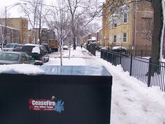
According to UK's National Counter Terrorism Security Office, there are everyday objects on the street in front of buildings, like bus stops, lampposts, and bins etc. These could have not just an apparent function, but could have a hidden purpose – To prevent terrorist vehicle attacks. A project by Toby Ng, a designer in London, is entitled "Hidden Superhero" and so he designed a set of unassuming CT Heroes.
Read More