Cogeco Dangles from the Cloud

download PDF (665 KB)

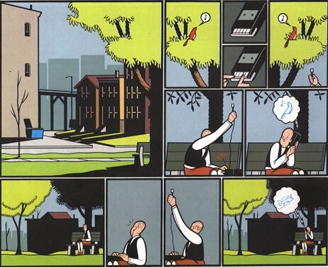
Alphachimp graphic recorder and cartoonist, Lloyd Dangle, produced this fun information graphic describing Cogeco Data Services, a wholly-owned subsidiary of the Canadian company, Cogeco Cable Inc.

The larger image was produced to announce the expansion of their cloud computing services:

To meet the growing demand for managed information technology services and support for cloud computing initiatives, Cogeco Data Services (CDS) is increasing its data centre space across the Greater Toronto Area, Barrie, Oakville and Vancouver to more than 100,000 square feet – almost two football fields. The Company is also offering a suite of managed IT solutions to help organizations deal with their increasingly complex and demanding data needs.

They apparently liked it so much, it is now headlining the company's website!


Chad Hagen's Nonsensical Infographics: BYO Data


Chad Hagen Complicated Triangle

Minneapolis-based designer Chad Hagen takes our love of infographics and turns our little heart inside out. For these are no aesthetically-plotted data sets full of statistics. In fact, we see no handy information at all, just the colors and shapes that typically make an infographic chart pleasant to examine in the first place.


NPR - Why Some Comics Work... and Some Don't

(via http://twitter.com/IFVP)

Jimmy Corrigan, The Smartest Kid On Earthis an example of a comic where the art is doing its job.(Random House)

Glen Weldon posts on NPR Arts correspondent Lynn Neary's piece on All Things Considered about the new graphic novel adaptation of Ray Bradbury's classic Fahrenheit 451. He breaks down what's right and what stinks about the last generation of graphic novels, and how the masters of the form make it work.

Read More

Comparing the Human and Chimpanzee Genomes

(via FlowingData)

Comparing the Human and Chimpanzee Genomes

As part of the Explore Evolution exhibit at the University of Nebraska State Museum, Judy Diamond displays a segment of the human genome in line with that of the chimpanzee that matches very closely. The point is to show how similar two are with the few differences represented by a drawing of a man, distinguished geneticist Svante Paabo.

See video of scintist Richard Dawkins explaining the exhibit.


Colorbrewer 2.0

© Cynthia Brewer, Mark Harrower and The Pennsylvania State University. www.axismaps.com

When building maps and information graphics, choosing the right colors to help designate variables--whether population, temperature, or campaign dollars--is a time-consuming challenge.

How does one choose colors that are effective in communicating data, that can be read by the colorblind, that can be considered print fiendly and/or "photocopy-able" ? 

The folks at Penn State have built Colorbrewer 2.0, an effective tool to swiftly aid in the process.

Once a palette is chosen, this free on-line tool allows for easy export to ArcGIS (a mapping app), Excel, or any Adobe product. You can also simply copy and paste the RGB, CMYK or HEX values.

Wordle Goes Mainstream

A century of most popular baby names - top 50 by decade

Yesterday's post commented on Fast Company's recognition of the importance of visualization skills. In their commentary, FC posted screenshots and video of word-images created with Wordle.

These Rorchschach-like wordmaps are fun, easy and effective to create with this (free) java-based web service. Many websites (including ours) now use the resulting images as navigation, sitemaps or splash screens. The Wordles give the viewer an instant impression of themes and importance ideas through font size and color.

I was blown away to see a Wordle used on the front page of USA Today as a feature article--not on the tool or on data visualization, but used as a graphic to illustrate the shifting trend in baby names!

Fast Company: Is Information Visualization the Next Frontier for Design?

The Tokyo firm Information Architects created this Web Trend Map which presents the most popular Internet sites in the intelligible graphic language of a subway system.

It is great to see that Fast Company is catching the visualization religion.

This post mentions the Obama speech Wordles, Tufte's screed against PowerPoint, and blogs that cover visual complexity (including the blog, Visual Complexity

Visualization may play a big role in wising up consumers. In the future, we're told, sensors will pick up tiny bits of info on every aspect of our lives and they will be played back to us as graphics. The smart grid, for example, will read the energy use in your home and send back understandable displays suggesting how you might save money by, say, waiting an hour to turn on your air conditioner or reducing your thermostat by two degrees. It will be up to architects to imbed this feature in the home in a way that allows us to interact more efficiently with our surroundings.

It's good to know, however, that Alphachimp Studio is on the frontier of design

Check out more Obama visualizations not mentioned by Fast Company (bastages) at The Center for Graphic Facilitation:

Quick Primer on Graphs and Networks

The power and flexibility of a network--whether a simple group of casual neighbors or a complex next generation communication network--depends not just on the number of connections, but on the quality of the nodes, and more important, the type of nodes. Below is a fantastic intro to the concept of graphs and networks. It helps in understanding the a social graph and how it differs from a social network.

In Mathematics, a Graph is an abstraction for modeling relationships between things. It is no different from a Network, which is a more common term for describing the same thing. Graphs consists of nodes and edges, or things and the ways that things relate to each other. As it turns out, Graphs are very powerful modeling tools for modeling natural and man-made systems. Diverse things like the Web, power grids, economies and even cells can be represented and analyzed as networks.


Note: Images above are from the Visual Complexity Gallery

What is also remarkable is that a lot can be said about a graph by looking at its structure; and the evolution of the structure. For example, epidemiologists use graph structures to predict the spread of an epidemic. The very same model can be used to understand how wild fire spreads, as well as how to engineer a viral marketing campaign. The better we understand the structure of a system's graph, the more we can control it, predict it and analyze it.


blog it

Innovation Conversations

As designers and facilitators of rich conversations, we serve a valuable role in innovation.


As facilitators, we can create the "safe container" for authentic (and often times emotional or caustic) conversations to occur, and for subtle, deep cultural shifts in thinking to begin.

As designers, we can give shape to the results of those conversations. We produce a thing--sometimes called a "work product" or "knowledge object" or "communication tool" or [insert corporatespeak term here].

These work products can take the form of a static model, a complex information graphic, a magazine article, a schematic diagram, a fully interactive website, a private wiki, an unedited blog post, or an airport lobby-sized installation art piece. The form is chosen for the target audience (and.. ah yes, the budget) in question.

Whatever the output, the real heart and soul of the innovation process seems to remain the conversation.

The network members of Social Media Today are playing in the emerging space of new ways to have those conversations.

Do Conversations Fuel Innovation?

The McKinsey Quarterly recent edition says Innovation has become a primary force in determining company growth, performance, and valuation. Unfortunately, a wide gap exists between executives’ aspirations to innovate and their ability to execute.”

Piers Gibbon writes about “The Innovative Conversation” The title was inspired by the researchers who have shown that “rich conversations”¹ have more value in business than “dehydrated, ritualized”¹ presentations. That “Connections and Conversations … provide the fuel for innovation” ² and companies need “to create a climate … where everyone feels the responsibility and desire to contribute to the organizations innovation performance.”

In economics, business and government policy,- something new - must be substantially different, not an insignificant change. In economics the change must increase value, customer value, or producer value.
The term innovation may refer to both radical and incremental changes to products, processes or services.